Color is not decoration. Color is the primary emotional driver in every photograph you take.
The Emotional Language of Color
Every color carries psychological weight. Understanding this weight is the difference between images that feel intentional and images that feel accidental.
Warm Colors (Red, Orange, Yellow)
Warm colors advance. They pull the eye forward, create urgency, and evoke energy, passion, and intimacy. In editorial photography, warm palettes signal:
- Romance and intimacy — (golden hour skin tones, candlelit interiors)
- Energy and movement — (saturated reds and oranges in action sequences)
- Nostalgia and memory — (warm color grading creates a sense of looking backward)
Cool Colors (Blue, Green, Purple)
Cool colors recede. They push the eye backward, create distance, and evoke calm, contemplation, and mystery. Cool palettes signal:
- Serenity and peace — (blue hour landscapes, misty mornings)
- Isolation and solitude — (cool, desaturated portraits)
- Intellect and sophistication — (muted, cool editorial palettes)
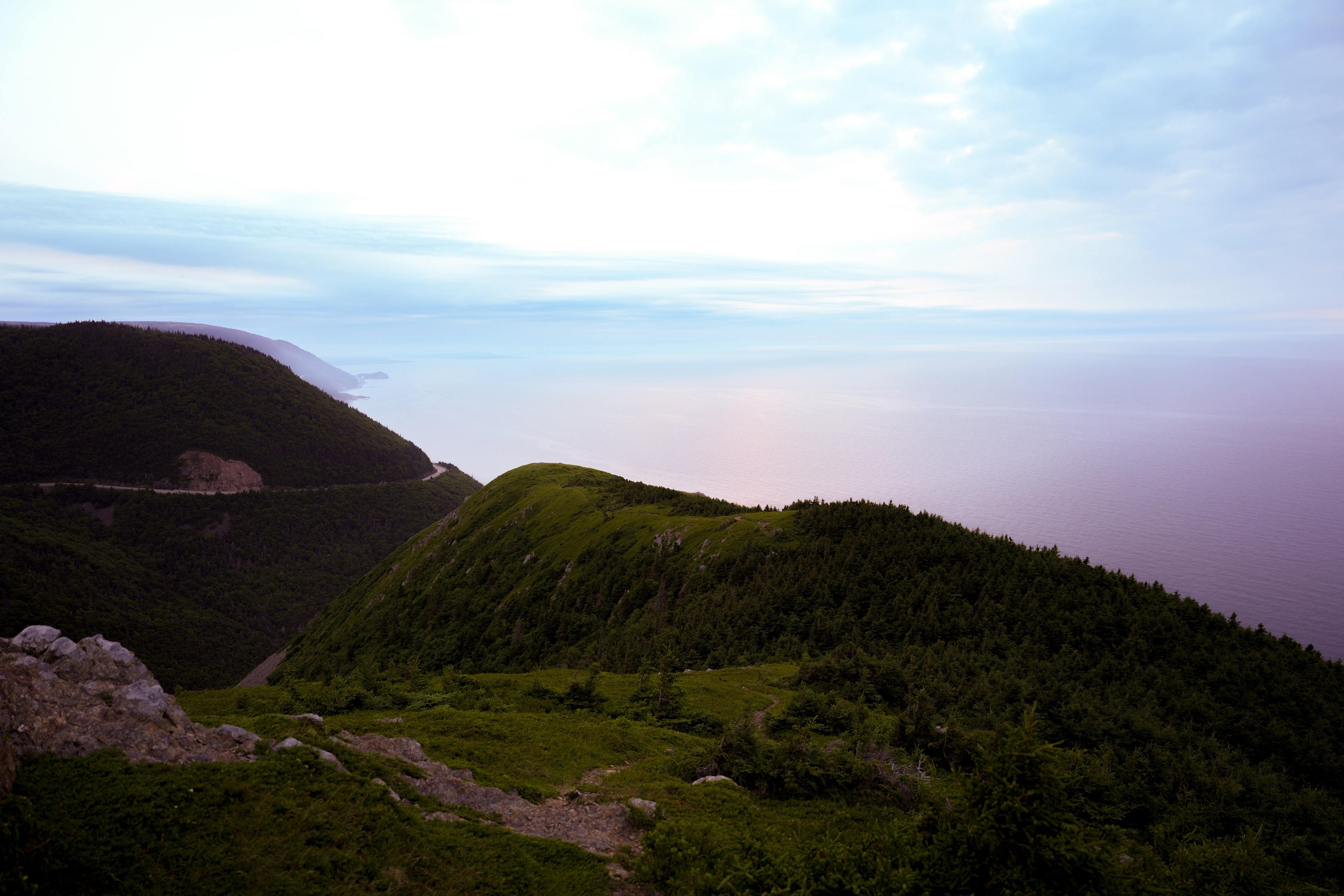
The Maritime Palette
The Atlantic coast naturally produces a color palette that is uniquely suited to editorial photography: cool blues and grays from the ocean and sky, punctuated by warm accents from stone, wood, and skin tones.
This natural palette is why Maritime photography has such a distinctive aesthetic. The environment provides a built-in color harmony that requires minimal intervention to achieve editorial quality.
Practical Color Control
In Camera
White balance is your first creative decision. Don't leave it on auto. Set your white balance intentionally based on the emotional tone you want to achieve.
- For warmth and intimacy: set white balance to "cloudy" or "shade" (adds warmth)
- For coolness and distance: set white balance to "tungsten" or manually lower the Kelvin temperature
- For accuracy: use a gray card and custom white balance
Film stock selection is the most powerful color decision you can make. Each film stock has a unique color response curve:
- Portra 400: — Warm, skin-flattering, natural
- Ektar 100: — Saturated, vivid, high contrast
- ProImage 100: — Neutral, accurate, versatile
- ColorPlus 200: — Warm, nostalgic, affordable
In Post-Production
Color grading is not color correction. Correction makes colors accurate. Grading makes colors emotional. They are different processes with different goals.
At The Curated Archive, our color grading workflow follows these principles:
1. Correct first. Achieve accurate white balance and exposure before any creative grading.
2. Grade with restraint. The best color grading is invisible. If the viewer notices the grade, you've gone too far.
3. Protect skin tones. Skin tones are the anchor of any image with people. No amount of creative grading should compromise natural-looking skin.
4. Grade for the medium. Images destined for print require different grading than images destined for screens. Print absorbs color; screens emit it.
Building a Signature Palette
Every great photographer has a signature color palette — a consistent approach to color that makes their work instantly recognizable.
Your signature palette should emerge naturally from:
- The environments you photograph most often
- The film stocks or digital profiles you prefer
- Your emotional response to light and color
- The subjects you're drawn to
Don't force a palette. Discover it through consistent practice and honest self-assessment.
Akshay Kumar leads color science and post-production at Akshay Kumar Studios. His approach to color grading has been influenced by the work of Saul Leiter, William Eggleston, and Stephen Shore.